Building OS
From virtual to hybrid
The event had to work in two realities.
Evolve North began in 2020 as a virtual LinkedIn summit for Canadian business leaders. When the experience expanded into a hybrid format, the identity had to connect people attending on screen and in person without losing the recognition already built.
Identity evolution
Recognition came with a constraint.
I explored a broader change to the identity, but the established wordmark already carried recognition. LinkedIn chose to retain it. That decision shifted the work from replacing the mark to building a stronger system around it, clarifying the year and endorsement while creating distinction through colour, typography and form.
Original design.
Created for the 2020 virtual summit, the lowercase wordmark and leaf motif established the event’s recognition.

Redesign.
The revised lockup retained the established wordmark while clarifying the year and LinkedIn endorsement for the next event.

Exploration
A more expressive route built around movement.
The first direction imagined Evolve North as a summit in motion. Athletic imagery and themes of focus, resilience and human momentum shaped the exploration. Northern Momentum became a visual system connecting people, ideas and formats.
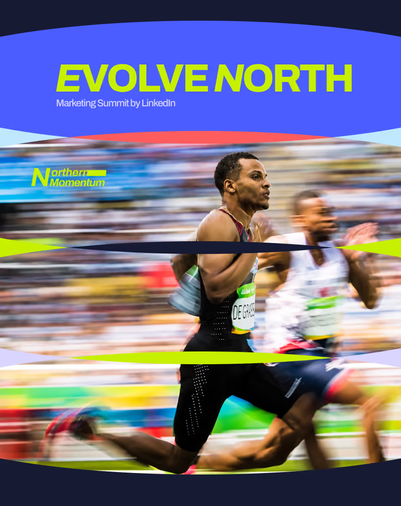
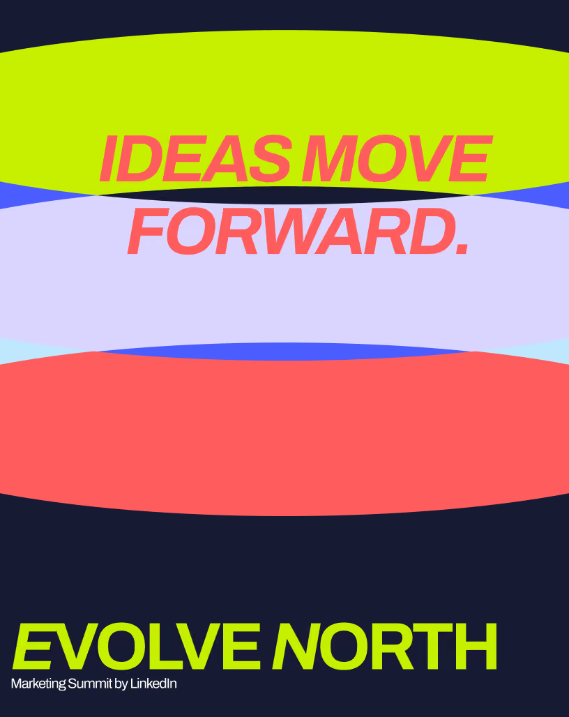
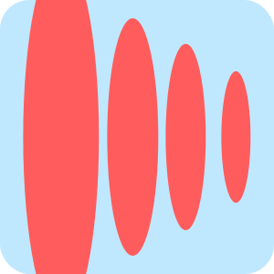
Repeated shapes expand and contract, creating a visual pulse that builds momentum across the composition.
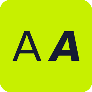
Contrasting typography balances athletic energy with the clarity and confidence expected from a business summit.
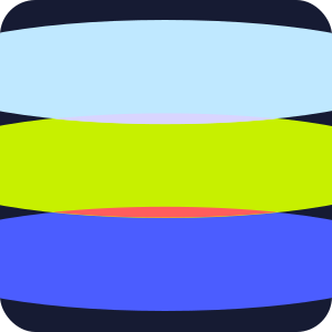
Electric colour introduces intensity, while dark ink and softer tones keep the system focused and controlled.
Turning point
Movement was right. The story was too narrow.
Northern Momentum created energy, but tied the identity too closely to athletic performance. The stronger opportunity was broader: express progress, connect physical and virtual audiences, and build a system that could move across campaign, broadcast and space.
A stronger sense of movement.
The identity needed to express progress rather than simply announce the event.
One language across two audiences.
Physical and virtual touchpoints needed to feel related from the beginning.
A system that could change scale.
The same visual logic had to work across campaign, broadcast and space.
The idea
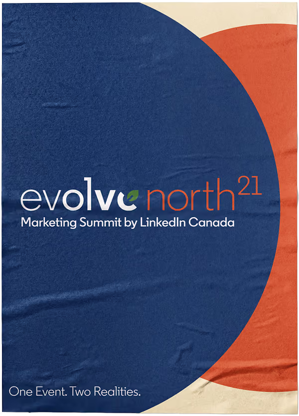
One event. Two realities.
A single visual system had to feel coherent whether the audience entered through a screen or a physical space.
System
The mark stayed. The system changed.
With the wordmark fixed, the surrounding language had to do more. Expanding forms introduced movement, colour created range and warmth, and typography kept the system recognizably LinkedIn across campaign, broadcast and space.
Shapes
Expanding forms created movement while giving the system a recognizable visual gesture.
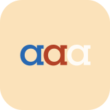
Colours
A warmer, more grounded palette helped the identity move from screen into physical space.
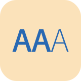
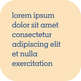
Typography
Clear, confident typography maintained LinkedIn’s professional voice across every format.
Campaign to experience
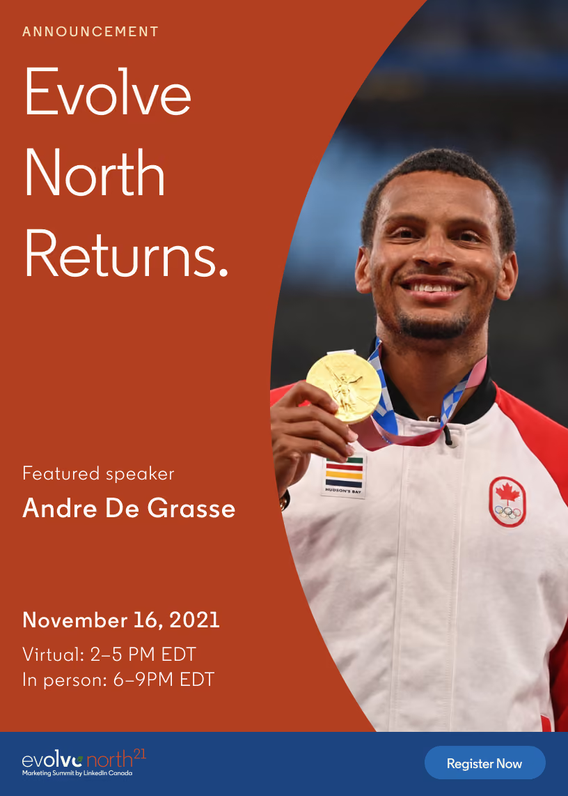
The event started before anyone arrived.
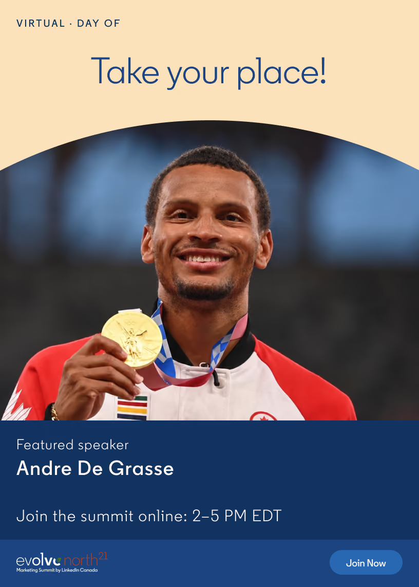
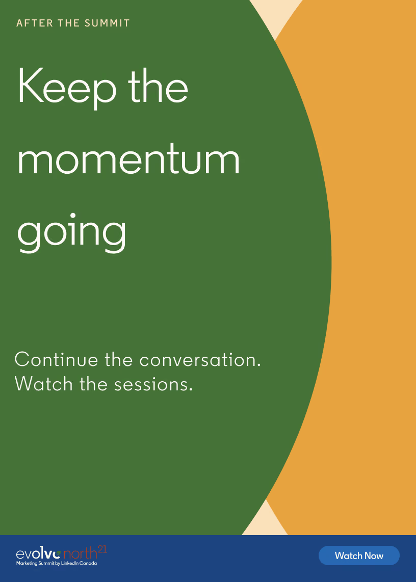
The same visual language moved through announcement, registration, event-day communication and arrival, making the experience recognizable before attendees entered either version of the event.
From screen to space
Every physical moment had a job.
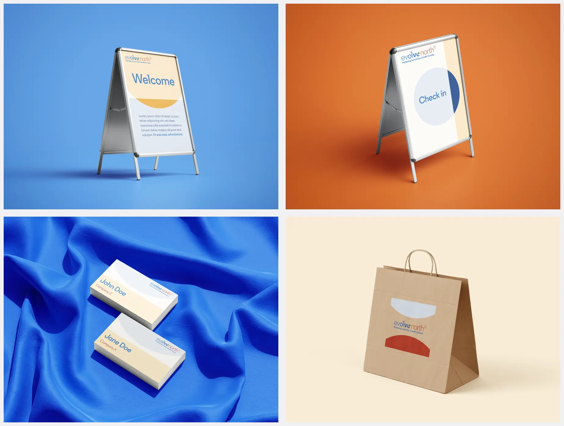
The system became functional in space: welcoming guests, orienting them, identifying participants and extending the event into takeaways. I carried it through signage, credentials, guest materials and final production artwork.
Event day
The system in use.
On-site photographs show how the identity carried through arrival, check-in and the event environment.


My role
